[Brand]
Sound of Life
[Industry]
Digital publishing
[Project goals]
Revamp SOL’s web design to improve the consistency and reinforce a strong brand identity.
[My scope of work]
Mood board
Revisit SOL social media asset. Gather inspirations from various resources.
Style guide
Set rules and standards for colour palettes, typography, iconography, logo usage and imagery guidelines.
Motion design
Conceptualise and develop motion graphics.
① Background
As a digital publishing that celebrates the intersection of music, lifestyle, and culture for a younger demographic,Sound of Lifehas grown to a global readership exceeding 1.67 million.
Due to the varying content and expanding audience base, the growth of subscribers count slowed down, and the average time stay on page experienced a significant decrease.

② Style guide
The primary target audience identified was college-educated and employed young adults. This demographic is shaped by a mix of ambition, social connection, and a continuous journey of self-discovery.
To ensure the new design resonating with their sensibilities and align with their life stage, yet still recognisable for those familiar with the brand, I conducted visual audit on SOL assets, and set the visual tone for SOL as follows: Confident, dynamic, and engaging.


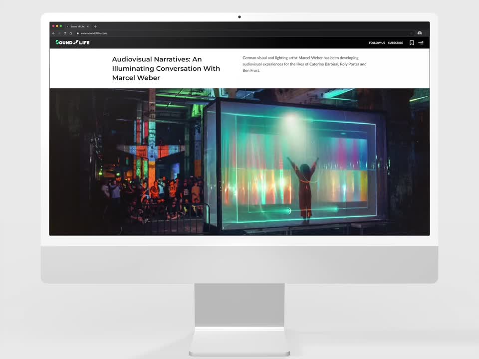
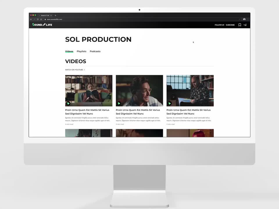
③ Final design
In addition to being more visually appealing, the new SOL provided better experience in many aspects,
Upgraded navigation among pages.
Smooth, intuitive and delightful interaction.
Responsive web design.
④ Impact